Adult Coloring Posters: The Complete Guide to Coloring Big
Published September 11, 2026 · By Cory Harper, founder of The Quiet Mind Project
An adult coloring poster takes the familiar idea of a coloring-book page and gives it room to breathe. The larger format can make a scene feel more immersive, create space for bolder color choices, and leave you with artwork designed to be seen after the coloring is finished.
This guide explains what makes large-format coloring different, how to set up a poster-sized project, how to choose a manageable palette, and how to protect your work between sessions. It focuses on useful technique—not claims about any particular paper or marker that we have not tested firsthand.
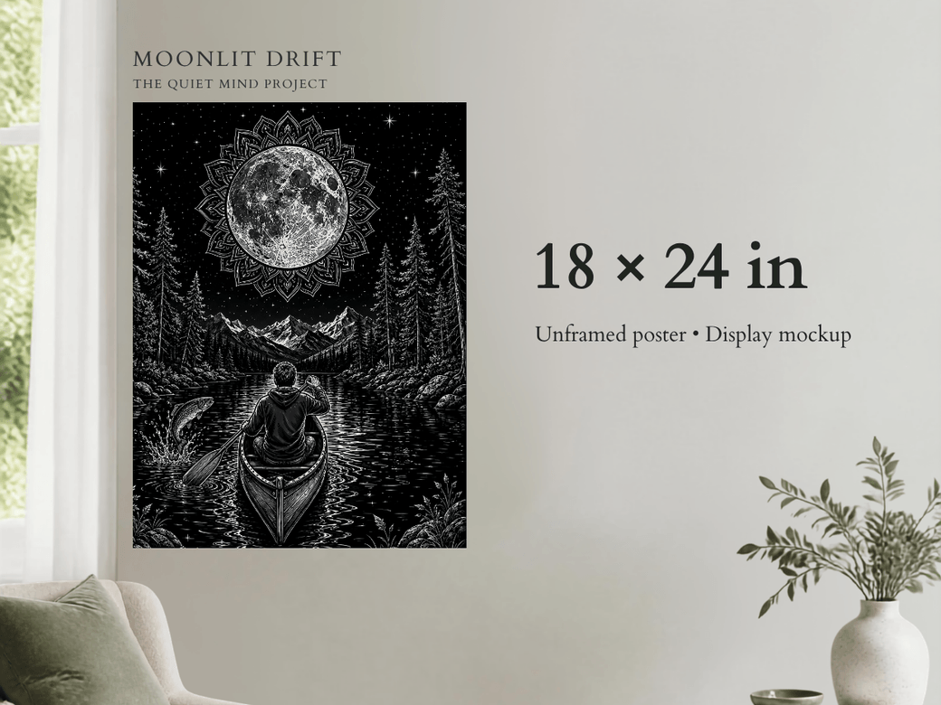
Moonlit Drift size-and-scale graphic. The poster is sold unframed; display images are mockups.
What is an adult coloring poster?
An adult coloring poster is a single large-format line-art design made to be colored over one session or many. Unlike a book, where dozens of smaller pages compete for attention, a poster treats one composition as the whole project.
The format can range from open, bold shapes to intricate scenes. The useful question is not simply how detailed the artwork is, but whether the detail is balanced. Large focal areas give you visible progress; smaller sections add interest without turning every inch into tiny work.
Adult coloring poster vs. coloring book
A coloring book is usually the better choice when you want variety, portability, and a low-cost stack of short projects. A poster is a stronger fit when you want one immersive composition, prefer a larger working area, or like the idea of displaying the result.
- Choose a coloring book if you want many designs, easy travel, or quick page-by-page variety.
- Choose a coloring poster if you want a longer project, larger visual impact, or a finished piece that can become wall art.
- Use both if small pages help you test palettes before you commit them to a larger composition.
Neither format is automatically more relaxing. The better choice is the one that matches your available space, attention, and preferred pace.
For a detailed decision-by-decision comparison, read Adult Coloring Poster vs. Coloring Book: Which Is Better for You?
Why large-format coloring feels different
Scale changes how you make decisions. You can see the whole composition at once, but you do not have to finish it at once. A poster invites you to work in sections: sky tonight, foreground tomorrow, small accents later.
Larger areas also make color relationships easier to notice. A dominant blue can affect how a warm orange reads across the page. Repeating a color in three distant areas can make the composition feel connected. These choices are possible on a small page too, but a poster makes them more visible.
Set up the project before you color
- Choose a clean, flat surface. Clear away crumbs, moisture, rough tools, and anything that can crease the sheet.
- Support the full poster. Avoid leaving a large section hanging over an edge where it can bend or catch.
- Add a protective backing sheet. Use a backing sheet whenever a tool’s instructions recommend one. Results vary by paper and tool; this is general preparation guidance, not a claim about Moonlit Drift.
- Keep scrap paper nearby. Use it to test color combinations, marker flow, pencil pressure, and gel-pen opacity.
- Decide how you will pause. Have a clean cover sheet, portfolio, or flat storage location ready before you begin.
Choose tools by the effect you want
Different coloring tools solve different problems. You do not need a giant set; a smaller, intentional group is often easier to manage.
- Colored pencils offer control, layering, texture, and gradual value changes.
- Water-based markers can create clean, bright blocks of color, though overlapping strokes may show.
- Gel pens are useful for small accents, highlights, metallic details, and controlled areas.
- Paint pens can create opaque accents, but their behavior depends heavily on the specific paper and pen.
- Alcohol markers can produce broad color areas and blending effects, but results depend on the exact paper and tool. Treat compatibility as unverified until that specific combination has been physically tested.
Tool labels alone do not guarantee a result. Paper coating, ink load, pressure, stroke speed, and repeated passes all matter. Moonlit Drift compatibility with specific pencils, pens, or markers has not yet been physically verified.
Build a palette that is easy to finish
Start with a mood, not a pile of markers. For a nature scene, you might choose cool moonlight, warm sunset colors, deep forest tones, or a limited black-and-gold look. Then build a small palette around that direction.
A practical beginner palette can use:
- one dominant color family;
- one neighboring color family for harmony;
- one contrasting accent color;
- one dark value and one light value for depth.
Before coloring the poster, make a small swatch row on scrap paper and place the colors beside one another. If every color is equally bright or equally dark, add one quieter or lighter choice. Variation in value often matters more than adding more hues.
Plan the composition without overplanning
You do not need to assign every section in advance. Make three decisions first:
- Where should the viewer look first?
- Which two or three colors will repeat across the design?
- Which areas should stay quiet so the focal point can stand out?
Then begin with a medium-sized section rather than the most important focal point. That gives you time to learn how the tool behaves before you reach the area you care about most.
How to color large areas more evenly
Large spaces reveal streaks and pressure changes more easily than tiny shapes. The most reliable approach depends on the tool, but a few habits help:
- Work in smaller adjoining zones instead of trying to cover the entire area at once.
- Keep stroke direction consistent within a section.
- Use lighter pressure first with pencils, then build additional layers.
- With markers, follow the manufacturer’s directions and practice the stroke on comparable scrap paper before applying it to a poster.
- Build coverage gradually rather than assuming extra passes will improve the result.
If a medium is not giving you the surface you want, switching tools for the largest background area can be smarter than fighting it.
Work in sessions and protect unfinished art
A poster does not have to be a one-night project. Before stopping, let any wet areas dry completely, remove loose pencil debris gently, and place a clean sheet over the artwork. Store it flat where it will not be exposed to moisture, direct sun, pets, or items placed on top.
When you return, look at the whole piece from a few feet away before adding more color. Distance makes it easier to notice balance, repeated colors, and areas that already have enough detail.
From coloring project to wall art
Decide early whether display is part of the goal. Keeping edges clean and avoiding folds gives you more options later. Standard-size posters are usually easier to frame than unusual dimensions, but always verify the finished piece and the frame's actual opening before buying anything.
You can also photograph the finished work before framing it. A straight-on photo in even light creates a useful record and helps you compare the full composition before deciding whether it is truly finished.
Is a large coloring poster right for you?
A coloring poster may suit you if you enjoy returning to one project, want more room than a book page offers, or like making something that can remain visible after the activity is over. It may be less suitable if you need maximum portability, have very little flat workspace, or prefer finishing a new design every few minutes.
Frequently asked questions
Do I need art experience?
No. A limited palette, a protected work surface, and a willingness to work one section at a time are enough to begin.
Do I have to finish the poster in one sitting?
No. Large-format work is well suited to multiple sessions. Store it flat and covered between sessions.
Which coloring tools should I use?
Choose tools based on the control and effect you want, follow the manufacturer’s instructions, and test on comparable scrap paper when possible. Moonlit Drift compatibility with specific media has not yet been physically verified.
How many colors should I choose?
There is no required number. Beginners often find a limited group easier to repeat consistently across a large design.
Should I frame the poster before or after coloring?
Color it first. Then measure the finished sheet and compare it with the frame opening and mounting method you plan to use.
A large project, one quiet section at a time
The appeal of a coloring poster is not speed. It is the chance to settle into one scene, make visible progress, and finish with something you chose color by color.
See Moonlit Drift, our 18×24 adult coloring poster, or return to the Articles & Guides hub.